

111. GridPaper
The GridPaper widget draws a rectilinear grid of 1-pixel-wide lines. You can modify the color which defaults to a light blue as well as the divisions, interval and subdivisions. The grid is drawn over the child widget.
  @override
  Widget build(BuildContext context) {
    return SizedBox(
      width: double.infinity,
      height: double.infinity,
      child: GridPaper(
        color: Colors.red,
        divisions: 1,
        interval: 200,
        subdivisions: 10,
        child: Image.asset('assets/dashatar.jpg'),
      ),
    );
  }
112. GridTile
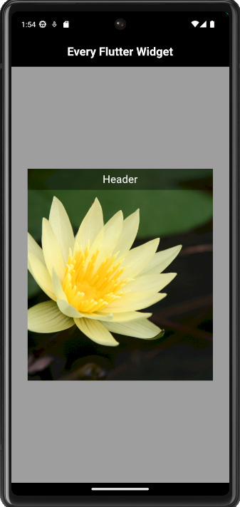
This widget creates a tile that is commonly used in a grid layout. It allows you to display content with an optional header and footer. The footer is the widget displayed at the bottom of the tile and the header is the widget displayed at the top of the tile, you can use any widget but a GridTileBar is typically used in those positions.
  @override
  Widget build(BuildContext context) {
    return Center(
      child: SizedBox(
        height: 400,
        width: 350,
        child: GridTile(
          header: Container(
            height: 40,
            color: Colors.black38,
            child: const Center(
              child: Text(
                'Header',
                style: TextStyle(fontSize: 20, color: Colors.white),
              ),
            ),
          ),
          child: Image.asset(
            'assets/lotus.jpg',
            fit: BoxFit.cover,
          ),
        ),
      ),
    );
  }
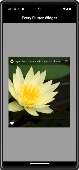
113. GridTileBar
The GridTileBar widget is typically used with the GridTile widget as a footer or header. It has customizable properties such as backgroundColor, leading, title, trailing and subtitle.
  @override
  Widget build(BuildContext context) {
    return Center(
      child: SizedBox(
        height: 400,
        width: 350,
        child: GridTile(
          header: const GridTileBar(
            backgroundColor: Colors.black38,
            leading: Icon(Icons.local_florist),
            title: Text(
              'Nymphaea mexicana is a species of aquatic plant that is native to...',
            ),
            trailing: Icon(Icons.menu),
          ),
          footer: const GridTileBar(
            backgroundColor: Colors.black38,
            leading: Icon(Icons.favorite),
          ),
          child: Image.asset(
            'assets/lotus.jpg',
            fit: BoxFit.cover,
          ),
        ),
      ),
    );
  }
114. GridView
The GridView widget creates a scrollable array of widgets. In the example below, we are using its builder constructor which takes a gridDelegate and itemBuilder. You can specify the number of items that will be in the GridView using the itemCount argument.
  @override
  Widget build(BuildContext context) {
    return GridView.builder(
      gridDelegate: const SliverGridDelegateWithFixedCrossAxisCount(
        crossAxisCount: 2,
        crossAxisSpacing: 2,
        mainAxisSpacing: 2,
      ),
      itemBuilder: (context, index) {
        return GridTile(
          header: const GridTileBar(
            backgroundColor: Colors.black38,
            leading: Icon(Icons.local_florist),
            title: Text(
              'Phalaenopsis is a plant of the orchid genus Phalaenopsis...',
            ),
            trailing: Icon(Icons.menu),
          ),
          footer: const GridTileBar(
            backgroundColor: Colors.black38,
            leading: Icon(Icons.favorite),
          ),
          child: Image.asset(
            'assets/orchid.jpg',
            fit: BoxFit.cover,
          ),
        );
      },
      itemCount: 20,
      padding: const EdgeInsets.all(2),
    );
  }