101. FittedBox
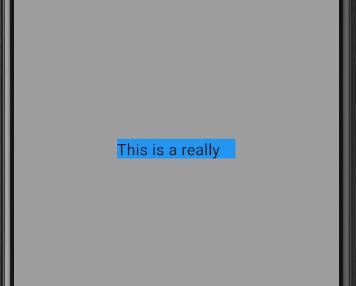
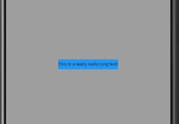
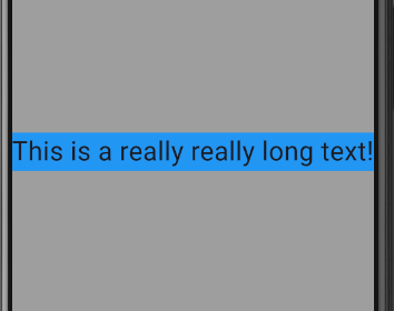
The FittedBox widget fits or sizes its child perfectly into its parent widget regardless of its size. In the example below, even though the text is long, the FittedBox fits it perfectly into the Container and when the width of the Container is increased, the text still fits into it perfectly.
//without the FittedBox
  @override
  Widget build(BuildContext context) {
    return Center(
      child: Container(
        width: 150,
        height: 25,
        color: Colors.blue,
        child: const Text(
          'This is a really really long text!',
          style: TextStyle(
            fontSize: 20,
          ),
        ),
      ),
    );
  }

//with FittedBox
  @override
  Widget build(BuildContext context) {
    return Center(
      child: Container(
        width: 150,
        height: 25,
        color: Colors.blue,
        child: const FittedBox(
          child: Text(
            'This is a really really long text!',
            style: TextStyle(
              fontSize: 20,
            ),
          ),
        ),
      ),
    );
  }

//with FittedBox and increased size of Container
  @override
  Widget build(BuildContext context) {
    return Center(
      child: Container(
        width: double.infinity,
        color: Colors.blue,
        child: const FittedBox(
          child: Text(
            'This is a really really long text!',
            style: TextStyle(
              fontSize: 20,
            ),
          ),
        ),
      ),
    );
  }


102. Flexible
The Flexible widget controls how the child of a Flex, Row or Column flexes. Unlike the Expanded widget which always causes its child to take as much space as possible, the Flexible widget won't have any effect if its child has a fixed size. The flex argument defines how much space the child widget will take. The fit argument determines how the child is inscribed into the available space, if you want the Flexible widget to act like the Expanded widget you can set the fit to FlexFit.tight.
//child has fixed height
  @override
  Widget build(BuildContext context) {
    return Center(
      child: Column(
        children: [
          Flexible(
            flex: 4,
            child: Container(
              height: 50,
              color: Colors.blueGrey,
            ),
          ),
          Flexible(
            flex: 3,
            child: Container(
              height: 100,
              color: Colors.green,
            ),
          ),
          Flexible(
            flex: 2,
            child: Container(
              height: 200,
              color: Colors.blue,
            ),
          ),
        ],
      ),
    );
  }
//child does not have a fixed height
@override
Widget build(BuildContext context) {
return Center(
child: Column(
children: [
Flexible(
flex: 4,
child: Container(
color: Colors.blueGrey,
),
),
Flexible(
flex: 3,
child: Container(
color: Colors.green,
),
),
Flexible(
flex: 2,
child: Container(
color: Colors.blue,
),
),
],
),
);
}103. FloatingActionButton
This widget is typically used in the Scaffold inside the floatingActionButton argument. If you want to change the button's position, you can use the floatingActionButtonLocation argument under the Scaffold widget which by default is FloatingActionButtonLocation.endFloat. It also has other customizable properties such as backgroundColor, focusColor, foregroundColor, shape, autoFocus and toolTip.
  @override
  Widget build(BuildContext context) {
    return Scaffold(
      backgroundColor: Colors.grey,
      appBar: AppBar(
        title: const Text(
          'Every Flutter Widget',
          style: TextStyle(fontWeight: FontWeight.bold),
        ),
        centerTitle: true,
      ),
      floatingActionButtonLocation: FloatingActionButtonLocation.startTop,
      floatingActionButton: FloatingActionButton(
        onPressed: () {},
        child: const Icon(Icons.add),
      ),
      body: Center(),
    );
  }
104. Flow
This widget is used to create a flow layout. The delegate parameter takes an implementation of the FlowDelegate class.
paintChildren tells Flutter where to draw each of the children using the FlowPaintingContext class. The paintChild method takes two parameters; an int representing the index of the child in the list and the transform representing the layout for the child.
class _Widget104State extends State<Widget104>
    with SingleTickerProviderStateMixin {
  late AnimationController menuAnimation;

  IconData lastIconClicked = Icons.menu;

  List<IconData> menuItems = [
    Icons.settings,
    Icons.notifications,
    Icons.menu,
  ];

  @override
  void initState() {
    menuAnimation = AnimationController(
      vsync: this,
      duration: const Duration(
        milliseconds: 300,
      ),
    );
    super.initState();
  }

  @override
  void dispose() {
    menuAnimation.dispose();
    super.dispose();
  }

  @override
  Widget build(BuildContext context) {
    return Flow(
      delegate: MyFlowDelegate(menuAnimation),
      children: menuItems
          .map(
            (IconData icon) => Padding(
              padding: const EdgeInsets.all(5),
              child: FloatingActionButton(
                onPressed: () {
                  if (icon != Icons.menu) {
                    setState(() {
                      lastIconClicked = icon;
                    });
                  }
                  menuAnimation.status == AnimationStatus.completed
                      ? menuAnimation.reverse()
                      : menuAnimation.forward();
                },
                foregroundColor: Colors.black,
                backgroundColor:
                    lastIconClicked == icon ? Colors.blueGrey : Colors.grey,
                child: Icon(icon),
              ),
            ),
          )
          .toList(),
    );
  }
}

class MyFlowDelegate extends FlowDelegate {
  MyFlowDelegate(this.animation) : super(repaint: animation);
  final Animation<double> animation;
  @override
  void paintChildren(FlowPaintingContext context) {
    double dx = 0.0;
    for (int i = 0; i < context.childCount; ++i) {
      dx = context.getChildSize(i)!.width * i;
      context.paintChild(i,
          transform: Matrix4.translationValues(dx * animation.value, 0, 0));
    }
  }

  @override
  bool shouldRepaint(covariant MyFlowDelegate oldDelegate) {
    return animation != oldDelegate.animation;
  }
}
105. FlutterLogo
This widget paints the Flutter logo. The style argument determines where the 'Flutter' text is drawn and where it will be drawn, by default it is FlutterLogoStyle.markOnly which draws only the Flutter logo. You can change the textColor and size of the FlutterLogo and customize the curve and duration properties for animating the changes in the style and textColor.
  @override
  Widget build(BuildContext context) {
    return const Center(
      child: FlutterLogo(
        size: 400,
        style: FlutterLogoStyle.horizontal,
        textColor: Colors.black,
      ),
    );
  }


