89. DropdownButton
The DropdownButton widget creates a button that you allows you to choose from a list of items. The button shows the currently selected item and an arrow that opens the menu for selecting another item. You can also use the DropdownButton widget in the app bar.
class _Widget089State extends State<Widget089> {
  String dropdownValue = 'Apple';

  @override
  Widget build(BuildContext context) {
    return Center(
      child: DropdownButton<String>(
        items: const [
          DropdownMenuItem(value: 'Apple', child: Text('Apple')),
          DropdownMenuItem(value: 'Peach', child: Text('Peach')),
          DropdownMenuItem(value: 'Pear', child: Text('Pear')),
          DropdownMenuItem(value: 'Kiwi', child: Text('Kiwi')),
        ],
        icon: const Icon(Icons.arrow_drop_down),
        onChanged: (fruit) {
          setState(() {
            dropdownValue = fruit!;
          });
        },
        value: dropdownValue,
        dropdownColor: Colors.blueGrey,
      ),
    );
  }
}
90. ElevatedButton
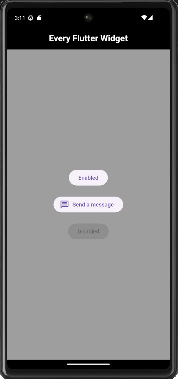
This widget creates an elevated button. You can disable the button by setting the onPressed as null. If you want an icon with the button you can use the ElevatedButton.icon() constructor.
class _Widget090State extends State<Widget090> {
  @override
  Widget build(BuildContext context) {
    return Center(
      child: Column(
        mainAxisSize: MainAxisSize.min,
        children: [
          ElevatedButton(onPressed: () {}, child: const Text('Enabled')),
          const SizedBox(height: 20),
          ElevatedButton.icon(
              onPressed: () {},
              icon: const Icon(Icons.message_outlined),
              label: const Text('Send a message')),
          const SizedBox(height: 20),
          const ElevatedButton(onPressed: null, child: Text('Disabled')),
        ],
      ),
    );
  }
}
91. ErrorDetails
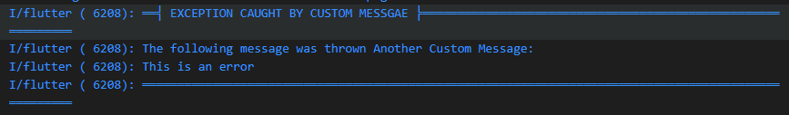
The FlutterErrorDetails widget is an alternative to using the debugPrint.
  try {
    throw ('This is an error');
  } catch (error) {
    FlutterError.reportError(
      FlutterErrorDetails(
        exception: error,
        library: 'Custom Messgae',
        context: ErrorSummary('Another Custom Message'),
      ),
    );
  }
92. ErrorWidget
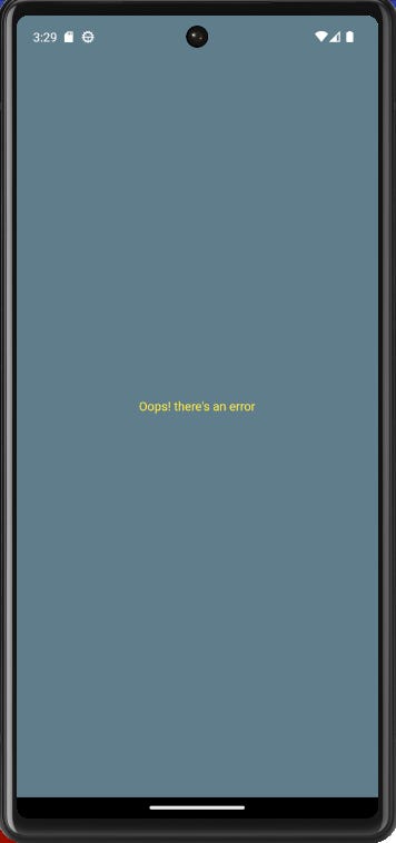
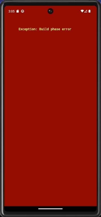
The ErrorWidget is responsible for rendering an exception's message in the UI when an error occurs during the build process. In the example below, since I’ve customized the ErrorWidget, when the button is pressed it displays the error message in the UI instead of crashing the app. If you want to see the default ErrorWidget only in debug mode, you can use the assert statement to render the default ErrorWidget conditionally.
void main() {
  ErrorWidget.builder = (FlutterErrorDetails details) {
    bool inDebug = false;
    assert(() {
      inDebug = true;
      return true;
    }());
    if (inDebug) {
      return ErrorWidget(details.exception);
    }
    return Container(
      alignment: Alignment.center,
      color: Colors.blueGrey,
      child: const Text(
        'Oops! there\'s an error',
        style: TextStyle(color: Colors.yellow),
        textAlign: TextAlign.center,
        textDirection: TextDirection.ltr,
      ),
    );
  };

  runApp(const Widget092());
}

class Widget092 extends StatefulWidget {
  const Widget092({super.key});

  @override
  State<Widget092> createState() => _Widget092State();
}

class _Widget092State extends State<Widget092> {
  bool throwError = false;

  @override
  Widget build(BuildContext context) {
    if (throwError) {
      throw Exception('Build phase error');
    }
    return MaterialApp(
      debugShowCheckedModeBanner: false,
      home: Scaffold(
        backgroundColor: Colors.grey,
        appBar: AppBar(
            centerTitle: true,
            backgroundColor: Colors.black,
            title: const Text(
              'Every Flutter Widget',
              style:
                  TextStyle(fontWeight: FontWeight.bold, color: Colors.white),
            )),
        body: Center(
          child: ElevatedButton(
              onPressed: () {
                setState(() {
                  throwError = true;
                });
              },
              child: const Text('Throw Error')),
        ),
      ),
    );
  }
}